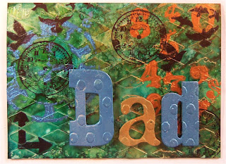
A 98% True Colors Card
After playing and testing all the products from True Colors, I wanted to see if I could make a card using only True Colors products and, considering the limited colors, etc. that I had to play with, this is what I finished. I actually love it!! Would love to know your thoughts so feel free to comment at the end or shoot me an email. Thanks!!
Then, I applied the Red, Green, Blue, and Gold Splendour alcohol inks from True Colors and blended them a bit with some Ranger blending solution.
Then I put another Crafter's Workshop stencil over the alcohol inks and, with the Ranger tool and some felt, I applied some of the Bronze Patina Ecologica from True Colors.
Then I used the clock stencil from Crafter's Workshop and applied some of the Lazuli Patina Ecologica over it. Allowed it to dry and then stamped some of Tim Holtz' images on the card front using Archival Jet Black.
Applied some popdots to the backs of the grungeboard letters I tried during my test and adhered them to the card front.
Final product. I really like it. And I hope my dad does too when he gets it.
~Michael
First I used the diamond stencil from Crafter's Workshop on white cardstock and the Aqua Transparente. And let that dry.
Then I put another Crafter's Workshop stencil over the alcohol inks and, with the Ranger tool and some felt, I applied some of the Bronze Patina Ecologica from True Colors.
Applied some popdots to the backs of the grungeboard letters I tried during my test and adhered them to the card front.
Final product. I really like it. And I hope my dad does too when he gets it.
~Michael


.jpeg)

.jpeg)
Michael my honest opinion I like it without the orange. Before the orange it is beautiful and you know me I hate green so this is my opinion
ReplyDeleteHugs
TA
Michael, are you still teaching at the Ink Pad in NYC? I've got a friend I want to send your way if you are.
ReplyDelete