Friday, January 6, 2012

A 98% True Colors Card

After playing and testing all the products from True Colors, I wanted to see if I could make a card using only True Colors products and, considering the limited colors, etc. that I had to play with, this is what I finished.  I actually love it!!   Would love to know your thoughts so feel free to comment at the end or shoot me an email.  Thanks!!


First I used the diamond stencil from Crafter's Workshop on white cardstock and the Aqua Transparente.  And let that dry. 


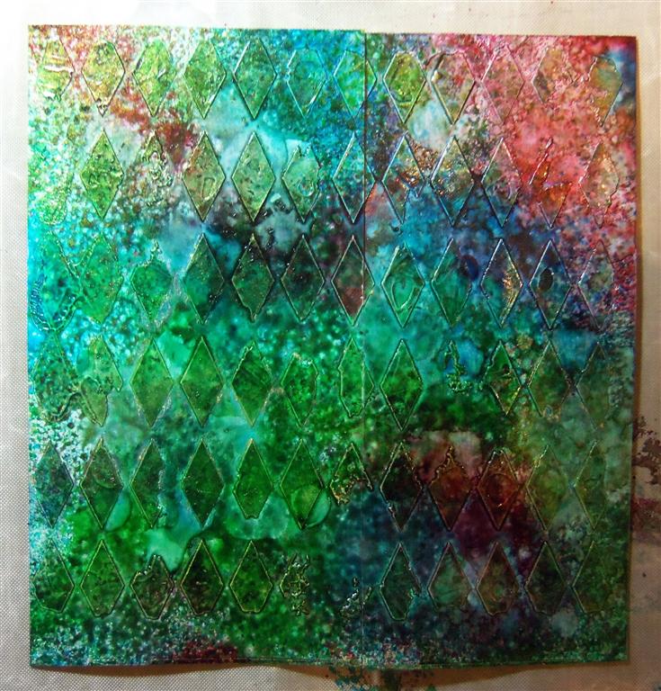
Then, I applied the Red, Green, Blue, and Gold Splendour alcohol inks from True Colors and blended them a bit with some Ranger blending solution.


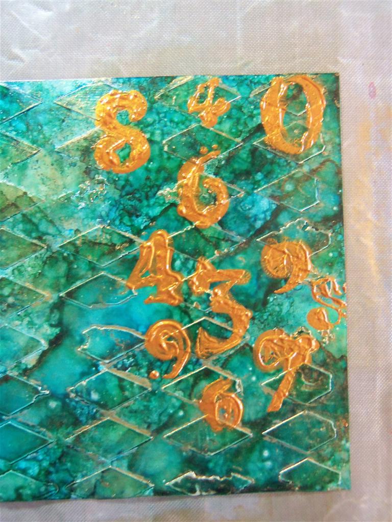
Then I put another Crafter's Workshop stencil over the alcohol inks and, with the Ranger tool and some felt, I applied some of the Bronze Patina Ecologica from True Colors.


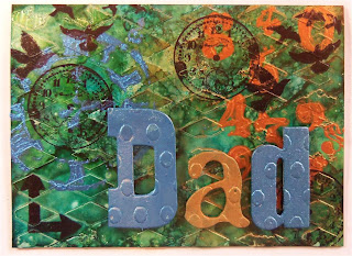
Then I used the clock stencil from Crafter's Workshop and applied some of the Lazuli Patina Ecologica over it.  Allowed it to dry and then stamped some of Tim Holtz' images on the card front using Archival Jet Black.


Applied some popdots to the backs of the grungeboard letters I tried during my test and adhered them to the card front.


Final product.  I really like it.  And I hope my dad does too when he gets it.


~Michael

Playing With True Colors Products

Following up on my post yesterday about going for training at True Colors - yesterday and today, for the first time in a long time, I got to just PLAY.  No tutorials to write, no projects to think about.  It was all about seeing if True Colors products work the way I am used to - and can I use these in my projects here and teach with them.  Well, the answer is YES!!

These are the products that Eduardo at True Colors gave me to play with.
My first project was to use True Colors Aqua Transparente, which is a clear transparent stencil paste, but not as thick as the pastes I am used to in the States.  I applied it to a flower stencil I had here on regular white cardstock and let it dry.  Next I used some of their Special Colors sprays, which is a water based spray, a bit like Ranger's Color Wash.  I only had a red, yellow, and metallic green, but I wanted to see if the sprays would NOT adhere to the clear stencil paste.  Sprayed some on the paper, then wiped the area with the clear paste with a paper towel and it came off.  Yeah!!  Test worked.


A bit hard to see but the stencil is in blue on the left and the piece of cardstock with the clear stencil paste is on the right.  

I sprayed the Special Colors over the whole piece of cardstock.

After I wiped away the colors from the where I had applied the Aqua Transparente.
Then I tried the water based Special Colors over a stencil on glossy paper.  The sprays adhered great, and I even got that nice metallic shimmer from the green.  Then I put a piece of plain cardstock over the stencil and rubbed so that the image went into the cardstock.  Nice.  Not bad.  Tests worked.

Left side is the Special Colors on glossy paper.  Right side is the excess absorbed by a piece of white cardstock.
Can you see the glimmer from the Metallic Green?  

Now for the True Colors alcohol inks called Splendour.  And they come in a spray.  Have never seen or heard about that in the States.  My favorite medium to work with are the alcohol inks by Tim Holtz and Ranger.  Let's see how they compare with what I am used to.

First up was using a domino.  Glossy, non porous.  With one or two sprays of the Extravagance Splendour, this domino was covered in a beautiful, almost candy apple red gloss.  Amazing!!  I was not expecting this. After I allowed it to dry completely, I found a small stamp and stamped it using the Archival Jet Black.  The image was there but not dark and bold.  Now this could be due to the deep red, that my ink pad needs to be re-inked, or the True Colors alcohol inks do not work the same way with the Archival as the Ranger do. More testing needs to be done.  I then re-stamped the image using Versafine and it came out much better, dried very quickly and has not rubbed off.  Maybe Versafine works with their inks.


Next up was using the Splendour over a stencil.  I first applied True Colors' Aqua Transparente over a Crafter's Workshop stencil on glossy paper.  I allowed it to dry and then used the alcohol ink sprays over it.

Look at these colors - how vibrant!!


The alcohol ink sprays adhere great.  I also tried their blending solution as well as Ranger's and I was able to spread the inks nicely over the piece using the felt.  The colors are beautiful and very vibrant.  Love it!!

Now onto the more traditional way of using Ranger's alcohol inks.  Let's see if I can take the inks from the True Colors' Splendour bottles and use them the way I would use Ranger's alcohol inks.  After searching high and low for simple spray bottles or small travel size bottles (don't ask, long story), I was able to find some in Sao Paulo last week.  Not having a bottle like the Ranger alcohol inks come in, I found a small travel size bottle and some eye droppers.  This was going to be the best I can do under the circumstances.  


First I did a sample using the Ranger alcohol inks.  I applied some of the Ranger inks (Lettuce, Red Pepper, and Butterscotch) to a piece of glossy paper with the felt applicator.  Then I applied some of the Ranger blending Solution and bounced the felt around again to get a lighter, more marbled effect.  And then, lastly, dripped a few drops of the Ranger blending solution on the inks. 


Ranger Alcohol Inks First Layer

After adding some blending solution to the felt. 

After dripping some blending solution right on top.
Now for the True Colors test.  Using the same glossy paper, and a new piece of felt, I put a few drops of the Splendour colors (Turquoise, Red, and Green) on the felt and bounced it around.  Then I applied a few drops of their blending solution and bounced that around the paper.  Okay, not the same effect, but very very close.  Honestly, much closer than I thought I would achieve.  


My final test to was drop some of the True Colors blending solution on the paper.  It did not spread the inks as quickly as the Ranger blending solution but, after a few minutes, I was happy with the way it came out.  


Yet, even after ten minutes, I noticed that the True Colors blending solution, although still working and thinning the ink, was still wet to the touch and taking a longer time to dry than I was comfortable with.  Hmmm, two hours later and after two beers, still not dry.

Six hours later, after dinner, still not dry.  Not going to work for me.  Okay, time to try a new way. 

Next test, same as above with the True Colors but trying the Ranger blending solution instead of the True Colors solution.  So I applied the True Colors Splendour Alcohol inks to some glossy paper as I did with the Ranger Alcohol inks.


Then I added some of the Ranger Blending Solution to the felt and went over the paper again.  Came out very nice considering I only have darker colors to work with.


Next up, I dripped some of the Ranger Blending Solution directly to the glossy paper.  It worked well, dried quickly, much more quickly than the True Colors Blending Solution.  It seems that if I want to use a blending solution with the True Colors inks, it will have to be a Ranger one.  Slight setback, but I can work with this.

Hmmm, what else?  Another product I love from the states is Viva Decor's Inka-Gold.  This is a paste like substance that you can rub onto pretty much anything for a really nice metallic sheen.  True Colors has a product called Patina Ecologica.  I got to play a bit with it when we were in their offices but I wanted to see how it would work on grungeboard or letters.  Let's see.

First up is using Inka-Gold in Steel Blue on a piece of grungeboard.  Some rubbing, buffing with a paper towel, and I like.


Next up, I tried the Patina Ecologica in Lazuli, which is the closest to the same color as the Steel Blue.  It is not as creamy as the Inka-Gold but also not a full liquid.  It's also a water based product so clean up is very easy.  I took a bit on my fingertip, rubbed it into the letter, buffed with a paper towel, and the results are just as good as the Inka-Gold.  Actually, I like it better as there is a bit more of a metallic sheen to it.  Almost as if there are small flakes of mica in the product.  Yeah!!


Now I am curious...since it is not as creamy as the Inka-Gold, I wonder how it will work in a stencil.  Let's see.  I taped a Crafter's Workshop stencil over a piece of plain white cardstock.  Then I brushed the Patina Ecologica over the stencil.  I decided to try a brush this time instead of my finger.  Removed the stencil and LOVE the results.  The Patina is creamy enough to act like a stencil paste at the same as it is acting as a paint.  Yeah!!

Tape stencil to white cardstock.

Brushed Patina Ecologica Lazuli over the stencil.

Removed stencil.  Looks great!

Can you see the slight texture?
Well, that's it.  I am really really happy with the results from my playing.  I think I can use most of these products in my work and classes and am very happy that I won't have to import product from the US.  Now time to see if I can make a full card with all the True Colors products.  That will be the next post.

~Michael

Never Ending Candle - Day 5 - Serendipity Stamp Scene

Welcome to the final day of my Never Ending Candle tutorials.  Today I am using several of Outlines Rubber Stamp Company's Serendipity Stamps to make a scene.  No bling, no crystals, no Viva, just stamping, coloring, lighting the candle, and enjoying.


Serendipity Scene Never Ending Candle

Supplies:
Candle in a glass jar or an empty glass jar
Stamps:  Summer Breeze (here), Wild Flowers (here), Lilly and Layla (here), Joyful (here)
Ink: Memento Tuxedo Black
Markers: Copic Flourescents FYG1 (Yellow), FYR1 (Orange), FYG2 (Yellow Green), FB2 (Blue), FRV1 (Pink), and Tombow Marker Nos. 055 (here), 173 (here), 725 (here), and 873 (here)
Post It Notes
Double Sided Tape
White Cardstock
Viva Decor Glitter Liner Holo Iridescent (here)


Directions:

1.  Cut a piece of white cardstock to fit around your jar or candle. 

2.  Stamp the right side of Wild Flowers and the right side of Summer Breeze on post it notes and trim.


3.  Stamp the Wild Flowers image on the left side of the cardstock.


4.  Adhere the post it note with the Wild Flower image over the right side of the image you just stamped.  Then stamp the Summer Breeze image allowing a bit of the image to stamp on the post it note.  This will allow the scene to look like it just keeps going without showing any break in the images.


Notice that in the tall flower the leaf on the left side did not fully stamp.  Just take a fine line marker and drawer it in to close up the image.  

5.  Adhere the post it note of Summer Breeze over the right side of the image you just stamped.  Now stamp Wild Flowers again allowing it to overlap just a bit.  Continue alternating until the whole piece of cardstock has been stamped.


6.  Stamp Lilly or Layla, whichever you want, or both, so it hovers near one of the larger flower images.  Then stamp the smallest butterfly from the Joyful set a few times in the scene.


8.  Color in your scene using whatever markers, pencils, or paints that you enjoy using.  If you use the same markers in the same flowers across the scene, it will go faster.  Use bright colors and go crazy.  It's a garden!!


9.  Add some stickles or Viva Decor Glitter Liner.  I added some Spiced Marmalade Stickles, some Viva Glitter Liner in Holo Iridescent and Sapphire.  Allow to dry.


10.  Add a strip of double sided tape to one end, wrap around the glass jar and adhere the other side.  Insert candle, light, and enjoy.


~Michael

Happy (Pizza) Pi Day | Sketch Challenge 19 with Tawny Owl Paperie | Inky Inspriation

Hello everyone and Happy Pi Day.  For many, Pi means 3.14 or 3.141592653589793238462643383279502884197.  But, for crazy cardmakers like me, ...